

A new chapter for a storied Atlanta consulting firm
Banner Day Packages
Messaging Brandbook (Strategy, Messaging & Consulting)
Website Copy
Team
Client: Coxe Curry & Associates
Creative Direction & Brand Design: Russell Shaw
Creative Direction & Messaging Strategy: Molly Dickinson
Brand Messaging: Acree Macam
Project Support: Rebecca Harlan
For their 70th anniversary, Atlanta’s beloved nonprofit consultancy was in the midst of a long-awaited rebrand, with creative direction and brand design led by Russell Shaw, celebrating and marking this momentous milestone. With the redesign already well underway, the team's vision expanded: They needed a strategic messaging partner.
Russell immediately and enthusiastically referred his Banner Day colleagues (Thanks, Russell!) and brought us into the rebranding team.
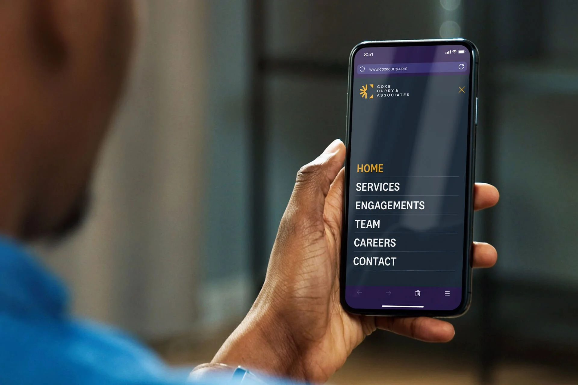
With their relaunch timeline and visual identity developing, we worked quickly and collaboratively to refine Coxe Curry’s brand compass (mission, vision, values, etc.) and evolve their brand positioning, messaging, and voice. Respecting decades of professional credibility while connecting with all of their audiences—and standing apart from competitors—was key. Sharing the firm’s deep experience and expertise in a conversational, community-focused tone not only fit their company's approach and values, it also helped them invite a broader audience into their brand’s story.
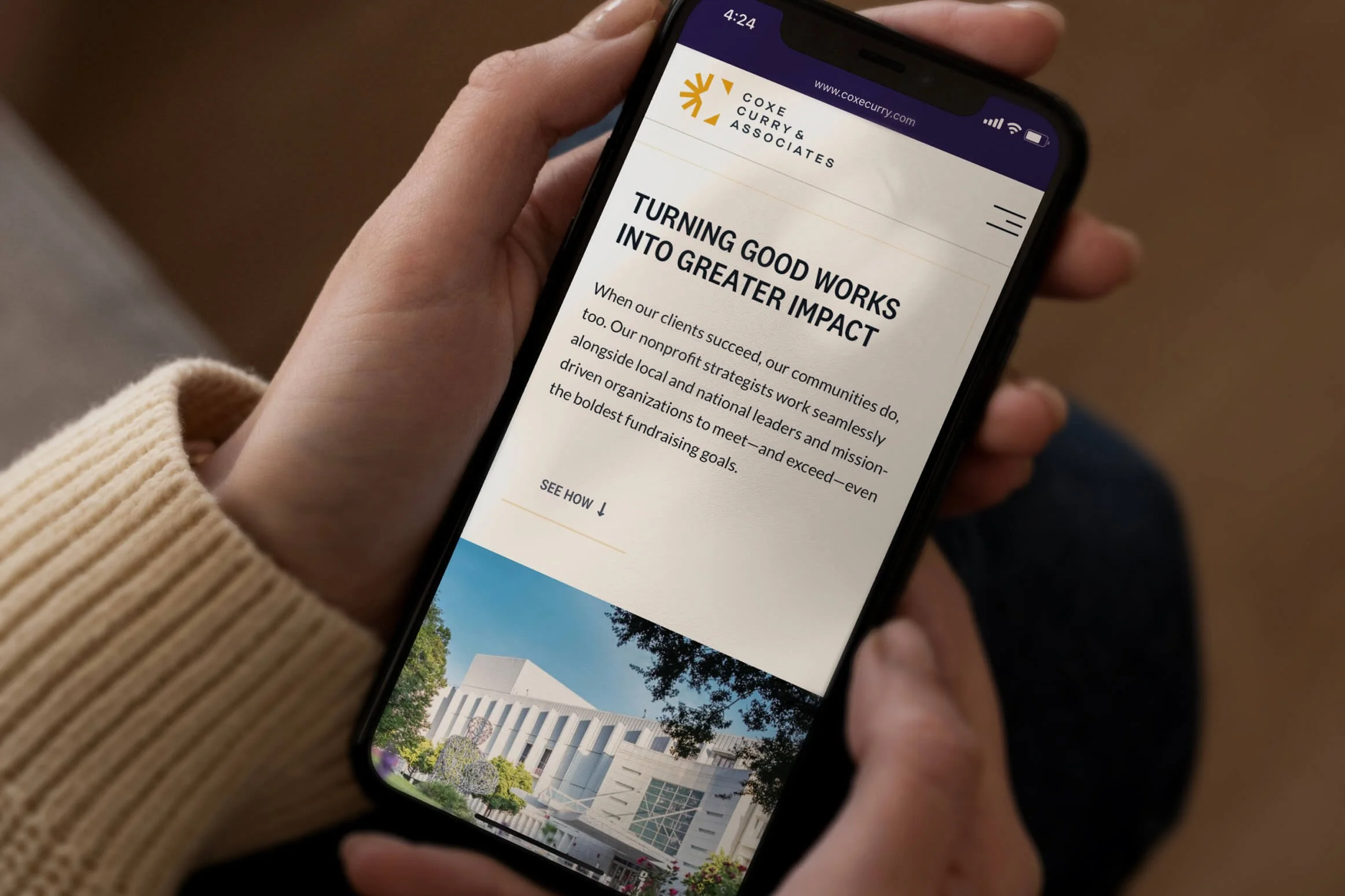
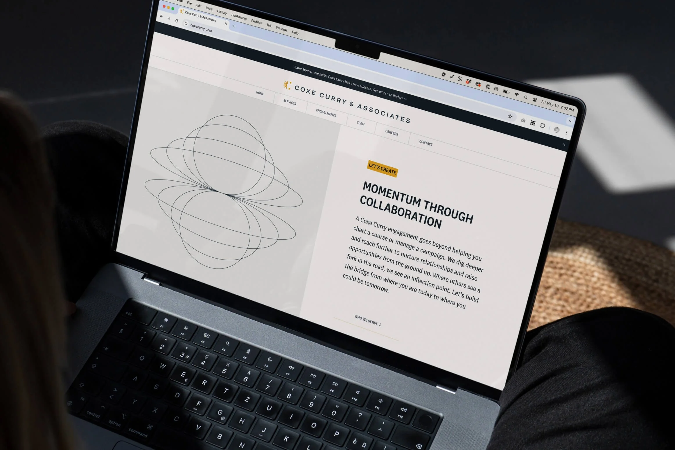
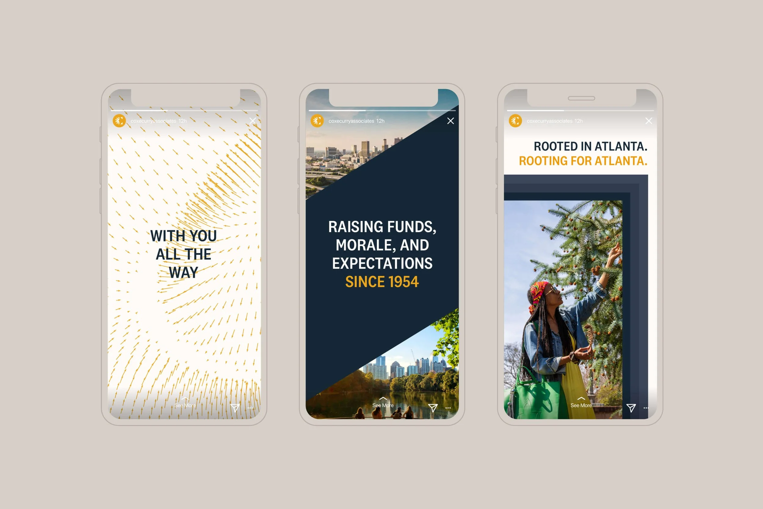
True to form, Coxe Curry deployed their rebrand with passion and precision. Today, you’ll see our collective work across every brand touchpoint—from LinkedIn banners, to their newsletters, to the signage in their new offices in downtown Atlanta. Within the first year following their launch, they’d already welcomed 12,000+ visitors to their new website and added hundreds of followers across their social platforms.
“It was a pleasure to work with both Russell Shaw Design and Banner Day as we took on a brand overhaul. We felt really heard during our collaboration, and the ecosystem they created exceeded our hopes and expectations for what was possible. Now, we’re well-equipped with a brand ecosystem of visual and verbal tools that are tailor-made to our mission and our work.”
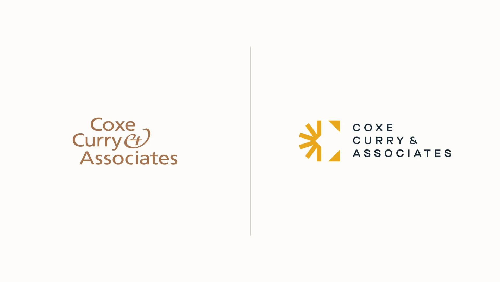
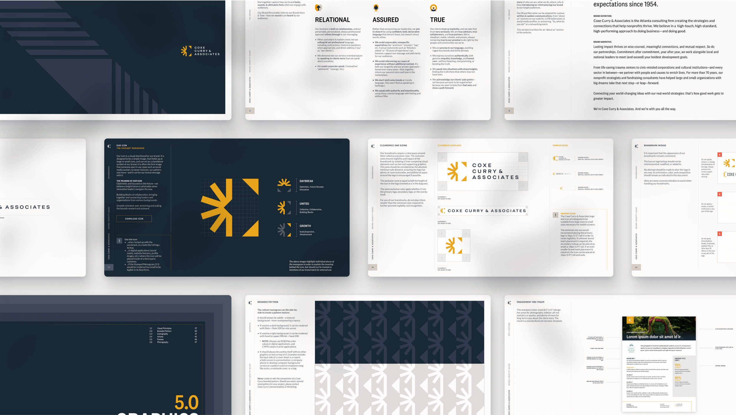
“The visual identity is built around two central design concepts that speak to the work of the firm: The connector and the multiplier effect. The new logo, lovingly dubbed the Radiant Monogram, is an abstract capital ‘C’ made of two diagonal, outward-facing arrows that indicate scaling up, with a burst resembling a sunrise left in the wake of the arrows. I used the monogram to create a branded, repeating pattern that is featured as a custom wallpaper in the office’s interior design as well as in many of their presentations and collateral.”
“Coxe Curry & Associates has been “in the room where it happens” with Atlanta leadership since 1954. They wanted a new message that would honor the legacy of their past while signaling the national presence they were growing into. Problem is, when you expand your reach, it gets much harder to get noticed. So, after holding an in-depth discovery session with the team to understand what makes Coxe Curry tick, we researched how others in their field were messaging. What we found was a sea of sameness, with expected language like “impact that matters” and “leaving the world a better place.” To help them stand out in a professional services world where approach is everything, we defined Coxe Curry’s distinction as a “high-touch, high-standard, high-performing approach to doing business—and doing good.” The message resonated with the team and gave them a strong point-of-view that stood out on a national stage.”
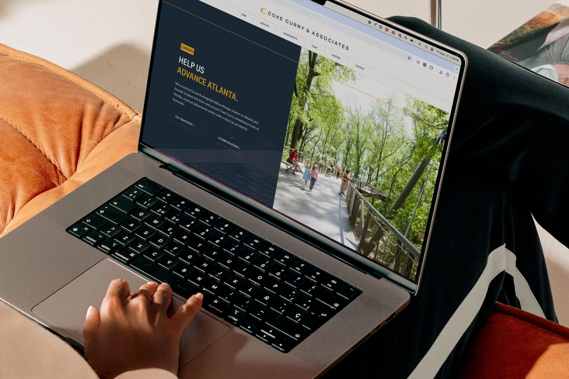
“Echoing the shapes in the monogram, triangular frames and arrows are then used across all of the art direction for branded communication to create bold visual assets. A range of tints that progressively build on one another form a series of striated, color-blocking gradients for backgrounds. In the branded custom icon library, the tints can be applied to solid shapes that form darker shades where two or more overlap and intersect, like an overprinting effect. All of this is wrapped in a new color palette featuring a striking, energetic gold—optimistic and bright—paired with creamy whites and a range of dark, slate tones that bring a maturity and a boldness to where they are headed next.”

See more in our Library